
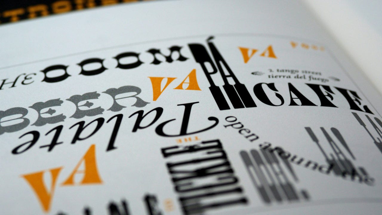
Make beautiful games with 5 free fonts
Use these five fonts the next time you want to branch out from the usuals. All of them are free, versatile, and particularly readable at a range of sizes.
I’ve written about font resources for game designers before. In that article, I shared the difference between a font vs. typeface, some tips on choosing a typeface, and five sites to acquire fonts.1 You should check that one out first.
This week, I want to share five specific fonts that I frequently use when designing games and other products for Exeunt Press. They are all free, versatile, and particularly readable at a wide range of sizes.
Five free fonts for your next design
1. Roboto
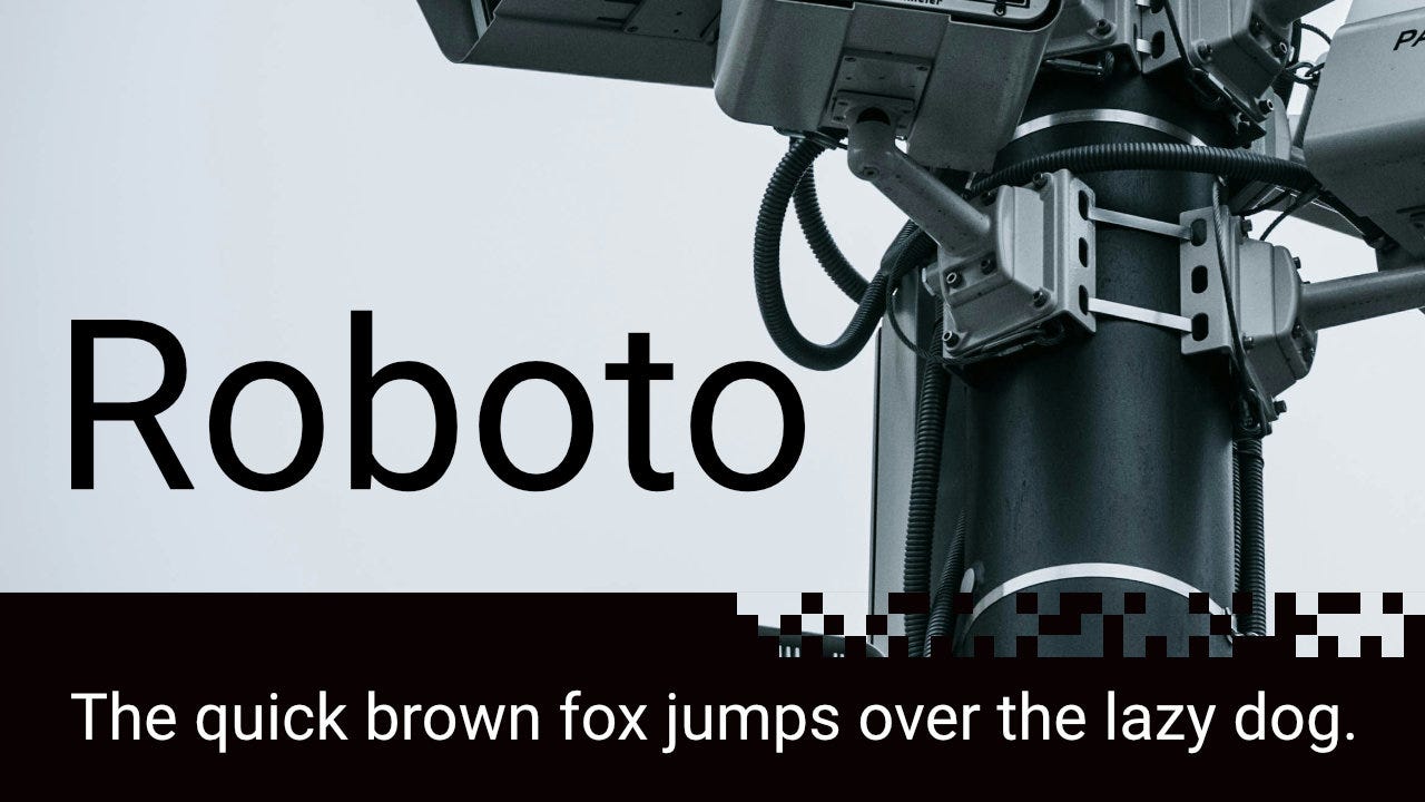
“Roboto has a dual nature. It has a mechanical skeleton and the forms are largely geometric. At the same time, the font features friendly and open curves. While some grotesks distort their letterforms to force a rigid rhythm, Roboto doesn’t compromise, allowing letters to be settled into their natural width. This makes for a more natural reading rhythm more commonly found in humanist and serif types.”
Roboto has that modern, neutral look that works in almost any setting. It works well on both screens and in print. The Roboto Black version is particularly good for bold headlines and titles. It’s prominently used in Tumulus, including the main title on the cover. Pairs well with Source Sans Pro, which has a nicer italics version in my opinion.
2. Crimson Text
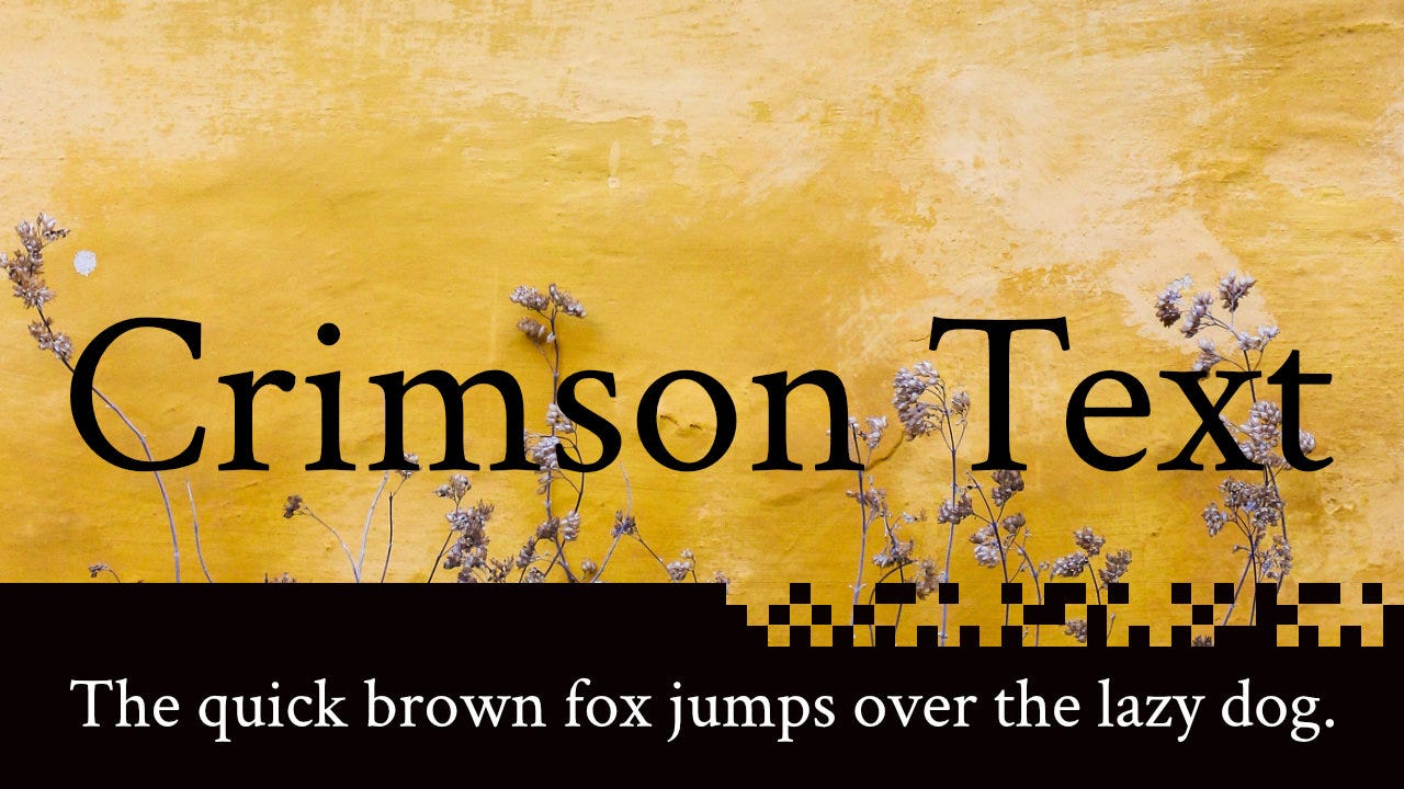
“Crimson Text is a font family for book production in the tradition of beautiful oldstyle typefaces. There are a lot of great free fonts around, but one kind is missing: those Garamond-inspired types with all the little niceties like oldstyle figures, small caps, fleurons, math characters and the like. In fact, a lot of time is spent developing free knock-offs of ugly "standards" like Times and Helvetica.”
Crimson Text has that old-school, serif look. Works really well for longer passages and large blocks of text, although it worked just as well in the one-page The Trench Grub’s Thirst. It also has some extra glyphs including fleurons — those little leaf things you sometimes see at the end of a section or paragraph. One quirk of the font is that the spacing between certain letters can be odd when bolded. There’s a similar Crimson Pro, but I prefer Crimson Text.
3. Inconsolata
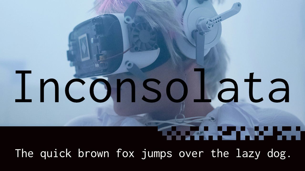
“Inconsolata was Raph Levien's first serious original font release. It is a monospace font, designed for printed code listings and the like. There are a great many “programmer fonts,” designed primarily for use on the screen, but in most cases do not have the attention to detail for high resolution rendering.”
I discovered this font by it’s heavy use in the MÖRK BORG and CY_BORG worlds. Inconsolata perfectly captures both a “typed” style and/or a futuristic style as needed. Narrow letters and a wide range of condensed variants makes it extremely flexible. Doesn’t look particularly great at large sizes and seems to work best for smaller text. It is my default font for things like Blackflower.
4. Pirata One
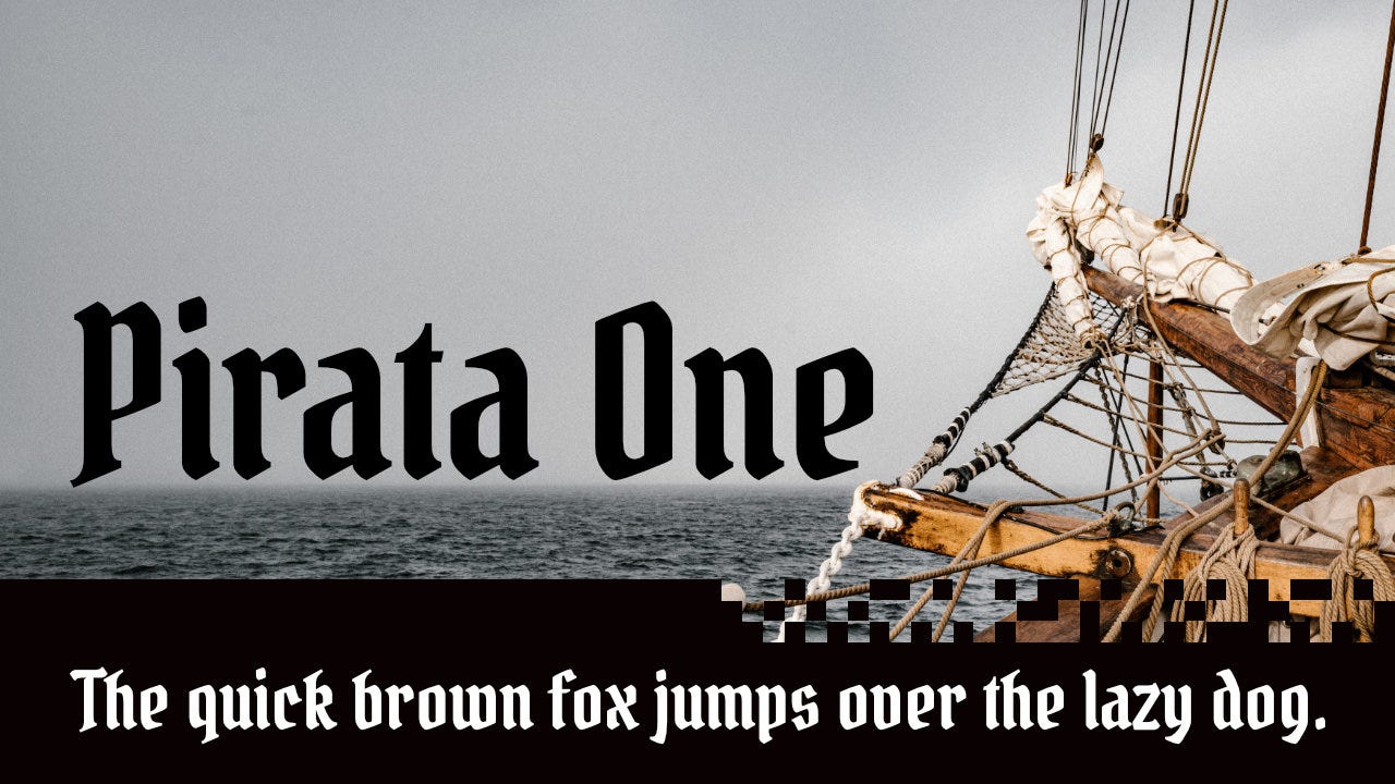
“Pirata One is a gothic textura font, simplified and optimized to work well on screen and pixel displays. Its condensed structure and spacing give it an excellent performance and rhythm on texts so it can be used as a header font or in shorts paragraphs.”
Fantasy game designers love blackletter fonts. Once you learn to recognize Pirata One, you’ll start to see it everywhere. From MÖRK BORG adventures to D&D supplements, it gives that medieval or pirate feeling while still being readable. Works especially well for headings and title. Not sure I’d use it for long passages. Consider pairing it with Grenze or Neuton.
5. Neuton
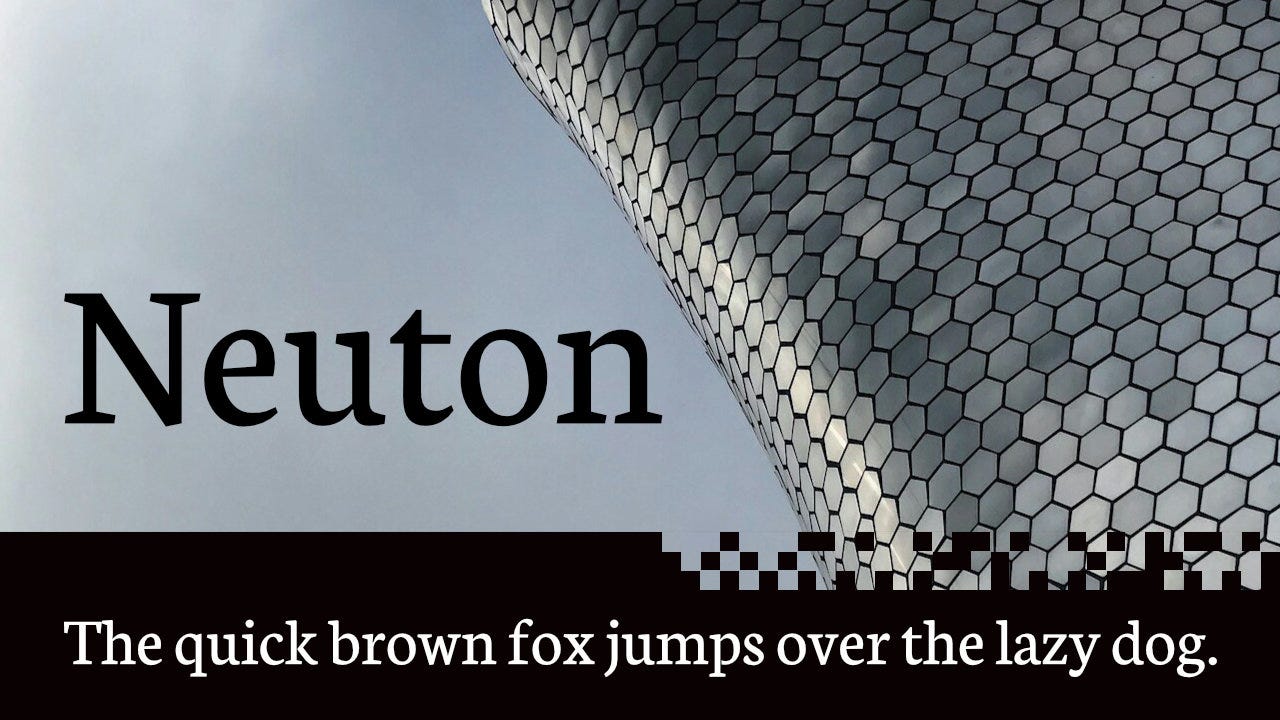
“Neuton is a clean, dark, somewhat Dutch-inspired serif font which reminds you a little of Times. It has a large height, short extenders, and a compact width for better screen use, and economy of space. The family will comprise a regular, italic, and cursive, each in five weights and with smallcaps. Two italics — one will be called "italic", and the other "cursive" — are uncommon, but very useful.”
Neuton doesn’t get as much love as it deserves. I know the spacing between letters can be a little odd at times, but this is one of my favorites. Works well in tight layouts where every millimeter counts. Looks traditional but with a little contemporary flavor. It doesn’t work as a decorative display font, but is perfect for headers, subtitles, and main text. The italics versions are nice too.
Beauty is in the eye of the beholder
Choosing the “right” font is a subjective endeavor. The fonts you prefer will be different from the ones I prefer and that’s OK. The five listed above should be considered starting points for your font journey, not a list of mandatory fonts that must be used. This is an art, not a science.
But trust me, branching out from Arial, Calibri, and the “clear and neutral tone” of Aptos will do wonders for your design. You don’t need to spend a fortune or pay for Adobe Fonts to switch it up a little.
Conclusion
Some things to think about:
Consider free fonts first: I love fonts and I understand how tempting it can be to spend money on that beautiful typeface you just saw on Instagram. I’d caution to only purchase fonts when you are about to use them, and check out Google Fonts first to see if there’s something similar at no cost.
Readability matters: It can be exhausting to read an overly ornate font when it is used for large blocks of text — doubly so when it’s placed on a “parchment” background. People won’t play your game if they can’t read it or if it’s tiring to read. Focus on making it easy to read first.
Choosing a (perfect) typeface is incredibly hard: While I’ve offered five of my favorite fonts that I use all the time, the options are limitless. The Typography in Ten Minutes guide is a great place to start if you are new.
What do you think? Which fonts are your favorites that you keep coming back to again and again? Have you found examples of good/bad typefaces in games? Which one of the five above is your favorite?
— E.P. 💀
P.S. “A beautiful, straight-forward, and inspiring book.” Get ADVENTURE! Make Your Own TTRPG Adventure, the latest guide from Skeleton Code Machine, now at the Exeunt Press Shop! 🧙
Skeleton Code Machine is a production of Exeunt Press. All previous posts are in the Archive on the web. Subscribe to TUMULUS to get more design inspiration. If you want to see what else is happening at Exeunt Press, check out the Exeunt Omnes newsletter.
Skeleton Code Machine and TUMULUS are written, augmented, purged, and published by Exeunt Press. No part of this publication may be reproduced in any form without permission. TUMULUS and Skeleton Code Machine are Copyright 2025 Exeunt Press.
For comments or questions: games@exeunt.press
Yes, I know fonts and typefaces aren’t the same thing. Yet most people use the terms interchangeably. I’m going to call them all fonts in this article. Apologies to font nerds everywhere.
Wanted to say thank you, I was struggling on what text to pick for my one page rpg jam submission last week and then this post turned up in my inbox. Used crimson text in the end so this was very timely!
I just used Source Serif Caption (https://github.com/adobe-fonts/source-serif) for a CD liner note and I would happily recommend that for when the text has to be small.
Parchment backgrounds and similar busyness are an abomination. Is it some weird kind of showing off? Never mind the quality, feel the width? Ugh! ;)