
Font resources for game designers
Typefaces, fonts, licenses, and five resources
Welcome to Skeleton Code Machine, a weekly publication that explores tabletop game mechanisms. Spark your creativity as a game designer or enthusiast, and think differently about how games work. Check out Dungeon Dice and 8 Kinds of Fun to get started!
Last week we looked at dice notation. This week we are looking at an introduction to fonts for game designers: fonts vs. typefaces, licenses, and where to find them.
Fonts vs. Typefaces
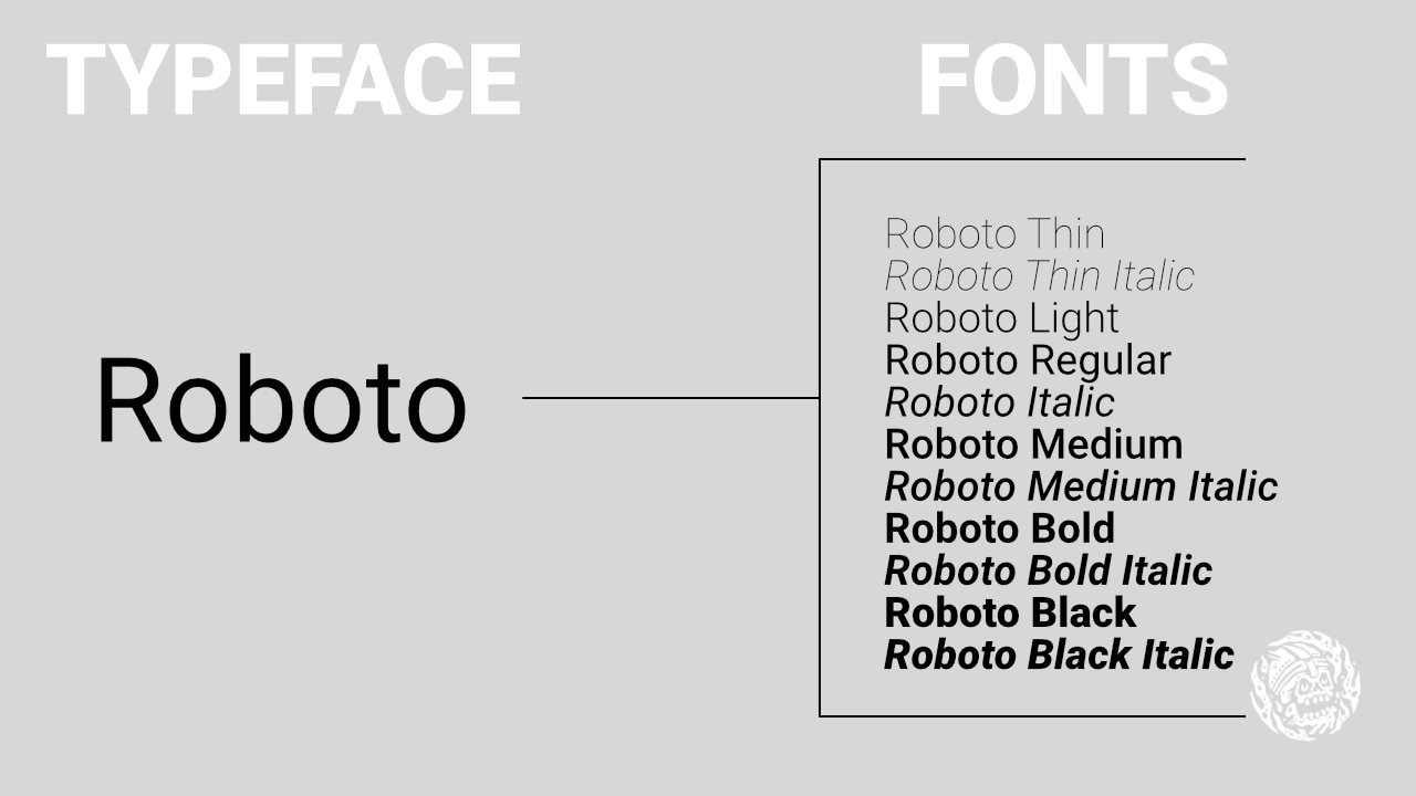
Many people use the terms “font” and “typeface” as synonyms, but there is a difference. A font is a specific variation of a typeface, usually with a specific style, size, and weight. A typeface refers to the overall design or family of characters with a consistent visual appearance.
Times New Roman is a typeface. Time New Roman Bold would be a specific font within the Times New Roman typeface.
That said, I’ll use the terms interchangeably in this article.
Choosing a typeface
Goblin Archives has a really helpful page about Layout and Typeface. This includes Johan Nohr’s famous Choosing a typeface thread on Twitter.
Basic Book Design at Wikibooks has some guidelines to get you started and keep you out of trouble.
For sizes, I recommend checking out Spencer Mortensen’s Typographic Scale article and related Type Scale Calculator.
Check the license
The resources below all have fairly clear and transparent licensing, but that’s not always the case. Some fonts can’t be used commercially, even if they are free to acquire. Others require a special license to embed in a PDF. Please read the license for any font you are considering before you use it.
There is also this note that I read at Hedonic Ink’s Choosing Fonts for TTRPGs:
I would advise against using Creative Commons licensed fonts. This is a generous gesture by the designer, but fonts are recognized as software, and requiring attribution introduces a strange wrinkle in our area of the hobby. For a book, adding “font by…” seems simple enough, maybe something you’re already doing, but what about a deck of cards, or a business card RPG? A logo? At the very least, be careful with it, as it signals that the author has very specific wishes you’ll want to be sure to honor if you use their work.
I’m not a lawyer, so I don’t really have much to add to that concern. Just something to think about.
Fonts in PDFs
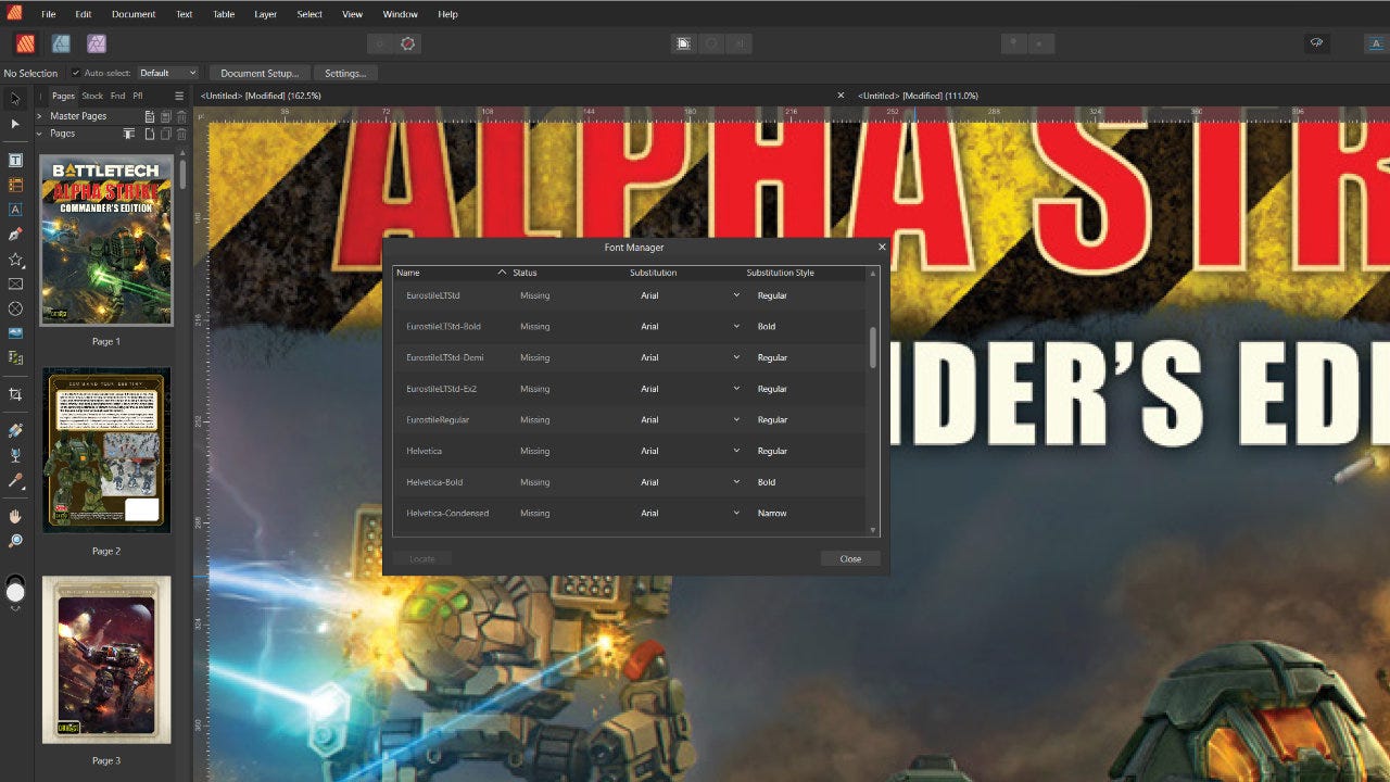
Curious what fonts your favorite designers are using? It’s fairly easy to find out.
If you are using Affinity Publisher, open the document in Affinity. It might prompt you to replace any missing fonts, so you can just say no. After the file is open, go to Window and Font Manager. You’ll see a list of all the font names used in the document.
You can also use Adobe Acrobat to achieve the same thing. Open the document, click File, and open Properties (Ctrl-D). Click the Fonts tab, and you’ll see a list of fonts used in the PDF.
Font resources
1. Google Fonts
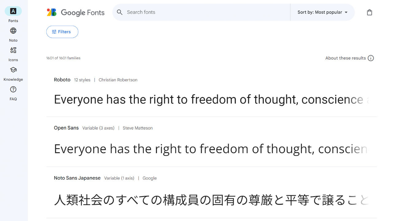
Google Fonts launched in 2010, and has somewhere north of 1,587 free font families in it’s catalog. The fonts are released either under the SIL Open Font License or the Apache License. If you have zero budget for fonts, start here.
2. Brandon Nickerson
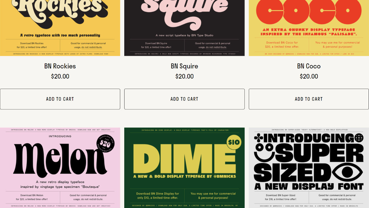
BN Fonts all seem to be extremely well crafted, with perfect spacing and kerning right out of the box. I recommend following BN on Instagram or signing up for the newsletter. You’ll get a notification when fonts are given away for free, which is quite often!
3. FONTS by Hinokodo
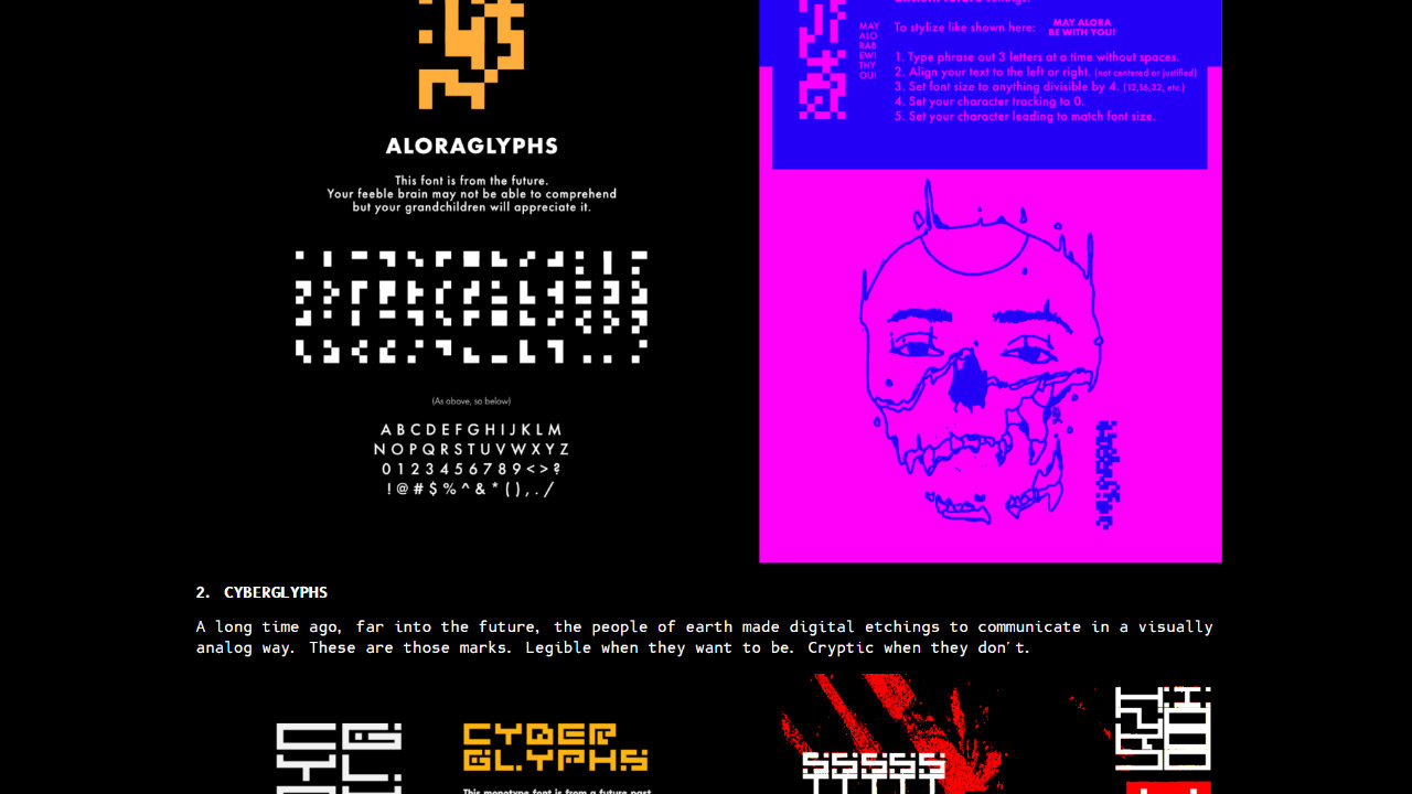
FONTS by Hinokodo (of MIRU fame) has three strange and decorative fonts, with possibly more in the future. Aloraglyphs is full of unreadable (unless you are an AI god) pixel art characters. Cyberglyphs is blocky and stylized. Cryptaglyphs is smoother, but still looks like an alien language. Not free, but very affordable.
4. Dicier by Speak the Sky
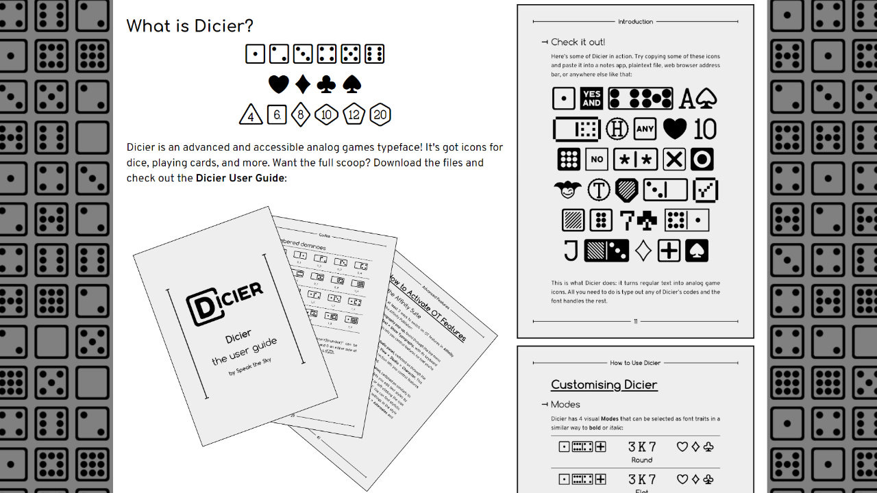
Dicier is a single font, rather than a collection like the other resources. With multiple modes, weights, styles, and a user guide, this font can do a lot! If you need dice pips, card suits, and polyhedral shapes in your game, this one is great. The font is licensed as CC BY 4.0, so you need to include attribution.
5. Legacy of Defeat
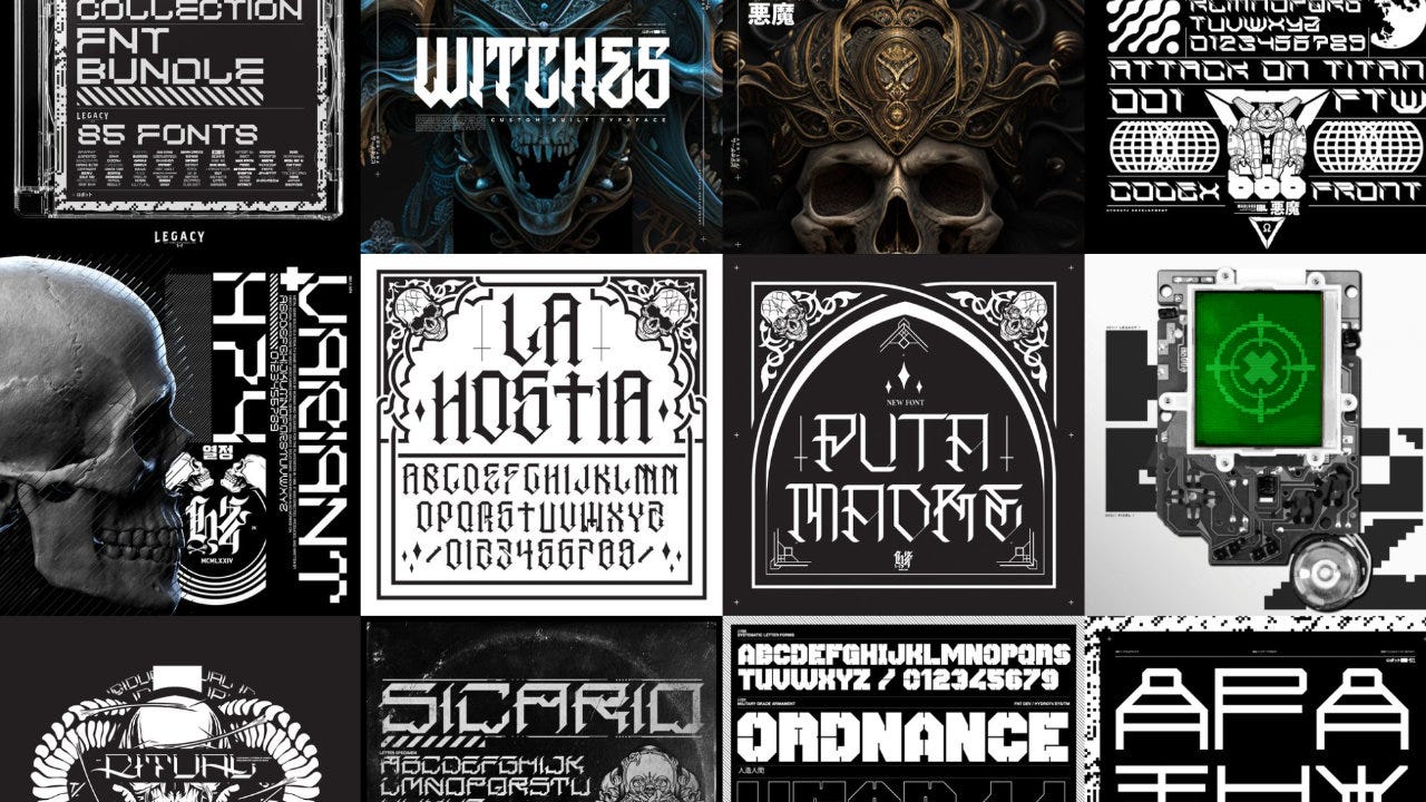
Legacy of Defeat is the font shop of Hydro74 / Joshua M. Smith. It’s packed full of brutal, cyberpunk fonts that work well for titles and decoration. There are a few free ones as well if you want to try them out. Note that while the fonts are beautiful, many have limited character sets (e.g. no dashes or extended punctuation) compared to other fonts.
Conclusion
Some things to think about:
Check the typeface license: Even if a font is free (as in no charge), that doesn’t necessarily mean you can use it in your game. Check the license.
Fonts can be used for more than letters: Aloraglyphs and Dicier are great examples of how fonts can be used for graphic design.
Consider purchasing a title font: It’s subtle, but a well chosen font can make all the difference on a TTRPG or board game cover. Don’t limit yourself to only free fonts if you can work a non-free one into your budget.
I’m sure I missed some really great resources for typefaces and fonts. If you have a favorite one, please share it in the comments!
— E.P. 💀
P.S. Get a Skeleton Code Machine shirt at the Exeunt Press Shop!
Skeleton Code Machine is a production of Exeunt Press. All previous posts are in the Archive on the web. If you want to see what else is happening at Exeunt Press, check out the Exeunt Omnes newsletter.
Little late to the party, but great article! One thing I didn't see mentioned that I really wish designers would keep in mind is that your body copy (as opposed to display or header fonts) should be legible and enjoyable to read FIRST.
I can't tell you how many times I've started reading a book and the typeface chosen for the body copy or the tables or whatever makes reading it an actual chore.
This is fantastic! Thank you for writing this up. I leaned a lot about fonts, and some things I'm doing wrong (and right) in choosing and using fonts in my own projects. 😅💖