
Exploring color palettes
Procedurally generating palettes from itch.io game covers

Last week we looked at Ten Years of Game Jams hosted on itch.io. This week we are back with itch.io, but looking at color.
But first…
100 Subscriber Sticker Giveaway
Last week Skeleton Code Machine broke the 100 subscriber mark! I’m really thrilled that people are enjoying this newsletter. Apparently there are many people that enjoy a mix of tabletop roleplaying games, board game mechanisms, and stupid Python tricks!
FREE STICKER GIVEAWAY! To celebrate, I’m going to select a few subscribers at random, and will send out some stickers for free! If you want to be eligible, just make sure you are subscribed before Friday, March 31, 2023. (Some restrictions may apply, and I need to be able to reasonably ship them to you.)
And now back to color palettes…
Color Palettes
I’ve been using the Seaborn Python data visualization library for most of the plots you see on Skeleton Code Machine. One of the reasons I use Seaborn is that the default color palettes and plot designs just look nicer, with very little extra work.
Here’s an example from last week with a combined scatter and rug plot using the ‘plasma’ palette:


The ‘viridis’ one is also quite nice:

That got me interested in investigating the other palette options, and eventually figuring out how to export color palettes from Seaborn and import them into Affinity Publisher. I posted a Twitter thread with step by step instructions, if you’d like to try it.
Here are most of the 176 default palettes included in Seaborn:

Anyone who has gone down the rabbit hole of RGB, CMYK, and HSL knows that color is an extremely complex topic. So it makes sense that choosing colors when doing data visualization can be complicated, and an art in itself.
The Seaborn Choosing Color Palettes Tutorial is a great place to start.
Cynthia Brewer’s Color Brewer is another good resource for color advice, with palettes that can be filtered by those that are Colorblind Safe, Print Friendly, and Photocopy Safe.
I’d say both are recommended reading if you are doing color design work for games.
Generating Color Palettes
So let’s make some new color palettes based on existing images!
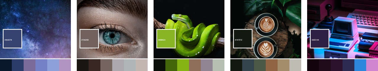
One way to do that is to use the fast-colorthief library, which is based on Color Thief. It takes an image and will return both a single “dominant color” as well as a color palette of N colors. The output is a list of RGB tuples for each color:
color-thief-test-images_1.png: [(42, 59, 105), (176, 148, 193), (121, 107, 154), (115, 130, 197), (10, 25, 46), (140, 159, 215)]Combine that with PIL and we can write the dominant color, hex value, and palette onto the original image.
Here are some examples from Unsplash:
It should be noted that Color Thief does generate some odd results for certain images, particularly pure black and white images:
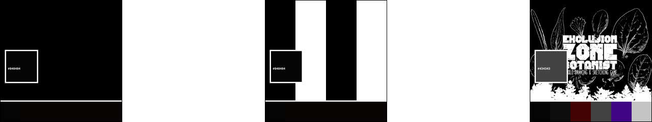
The pure black (#000000) image returns a different color (#040404) as the dominant color. Even though the Exclusion Zone Botanist image is pure black and white (and saved as a PNG) it still returns a reddish color and a purple. Also, it will throw a ‘RuntimeError: Empty pixels when quantize’ when attempting to run it on a pure white image.
If you have some theories on the purple, please comment below!
The Color of Itch Covers
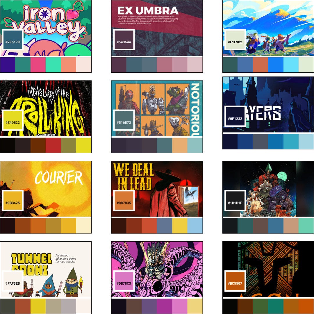
First we need to scrape the cover images for the most popular physical games on itch.io.
My first attempt using BeautifulSoup didn’t work, probably due to Javascript image loading. I ended up using Selenium and urllib to walk each page and save the covers. It wasn’t perfect, but I was able to quickly pull a sample of 167 covers as 315x250 jpegs.
After that, it’s as simple as using Color Thief to loop through all of the files. A few odd results on black and white or low-color images, but in general it works!
Here are a few examples:
Common Colors
What if we took all the palettes from all the cover images and combined them into a single image? That should give us a feel for the most common colors used by the most popular games!
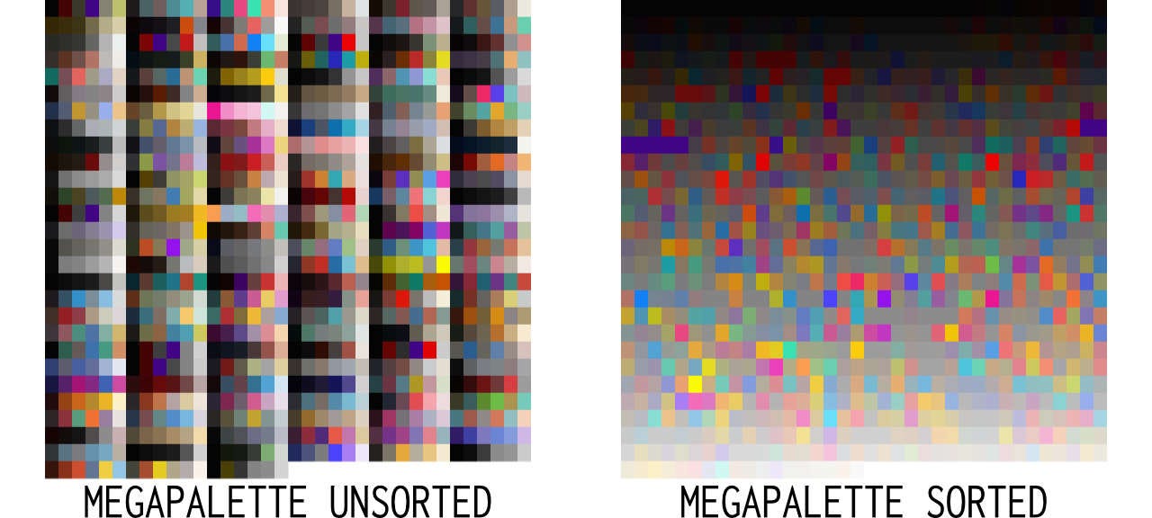
First, I learned that sorting colors is an incredibly challenging task. So to sort, I simply took the sum of the RGB values and used that.
I think a few things might be notable:
There are less bright colors than I’d expect. Lots of black, brown and gray.
There are enough pure black/white covers that the purple issue noted above shows up. You can see that in the purple stripe on the left side of the sorted image.
A cover with a brightly colored image really stands out.
What if we took the combined palette and tried to generate a palette based on that? This should be something like a palette of the overall most popular colors!
Here it is the megapalette palette:

There are some nice colors in there!
Conclusions
Some things to think about:
Color Thief isn’t perfect, but it’s really interesting. I had so much fun testing images, and generating palettes. You can try it yourself using the online demo.
Data scientists spend a lot of time thinking about color. I think tabletop game designers can leverage this to make sure their products are colorblind safe and have better information design.
Limited color palettes can be beautiful. Ellsworth Kelly’s Spectrum IV (1967) looks nice online, but it’s absolutely stunning in person. It might be a fun exercise to choose a 2, 4, or 6 color palette and design within those bounds.
Consider brighter colors to stand out. While not a rigorous quantitative analysis, it seems like itch.io covers skew toward black/gray/brown colors. There might be an opportunity to choose all bright colors to grab the attention of users browsing the site.
Thanks for reading, and don’t forget to subscribe before March 31, 2023 if you want a chance for some free Skeleton Code Machine and/or Exeunt Press stickers.
See you next week!
— E.P. 💀
UPDATE 9 MAY 2023: You can now download the 12-color megapalette at exeuntpress.itch.io/cmyk-color.
Very nice write up! The one thing that jumped out at me was the picture of the eye in your sample palette images. That blue was stunning in the photograph, but it doesn’t show up in the palette! I wonder if Color Thief might have missed more accent colors like that in your run of covers, leading to the noted skew toward darker colors.
That's a super nice newsletter. I need to do some digging into colorblind-friendly palettes and see how I can use them for the games I publish. I did a few low contrast covers that might not be ideal.